Making sampling maps using ggplot and R
06 Jun 2016 | bioinformatics, R
Here I will describe how to use the R package ggplot2 to draw a simple sampling map. ggplot is a terrific R package that is widely used to produce graphs and figures for scientific publications, as well as geographic maps.
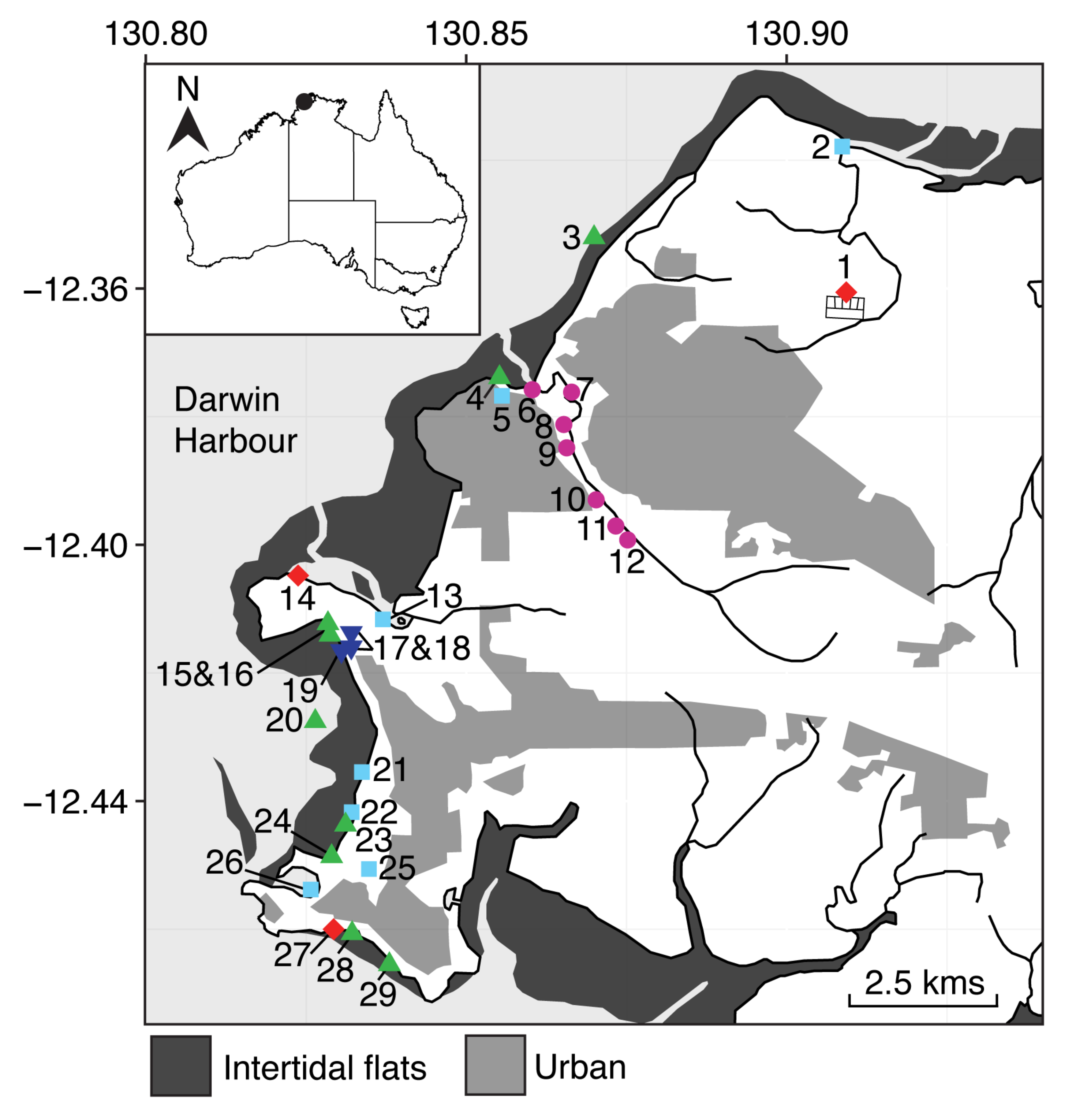
The code in this post was used to produce sampling maps for the following paper: Neave, M.J., Luter, H., Padovan, A., Townsend, S., Schobben, X., Gibb, K., 2014. Multiple approaches to microbial source tracking in tropical northern Australia. MicrobiologyOpen 6, 860-874. A pdf is available under publications.
Let’s first load the required packages. We will do most of the plotting with “ggplot2” as discussed. I’ll also load the library “maptools”, which will help us read GIS shapefiles.
# if these are not installed
install.packages("ggplot2")
install.packages("maptools")

# now load into our environment
library("maptools")
library("ggplot2")
We will need the geographic data of our region of interest for plotting. I was able to obtain GIS data from Geoscience Australia for the Darwin region. Many government organisations will provide geographic data free of charge for academic use. Google should hopefully help with finding data for your particular sampling area!
The downloaded data contains four files for each feature (*.dbf, *.prj, *.shp, *.shx). The feautres in my dataset include coastal boundaries, mudflats, lakes, river systems, inhabited regions, etc. We can now import this data into R using the function readShapeSpatial within the “maptools” package. Note that all four file types need to be present in the imported folder, even though the argument only specifies the *shp file.
darwin <- readShapeSpatial("./Shapefiles/d5204_frameworkboundaries.shp")
seas <- readShapeSpatial("./Shapefiles/d5204_seas.shp")
flats <- readShapeSpatial("./Shapefiles/d5204_foreshoreflats.shp")
watercourses <- readShapeSpatial("./Shapefiles/d5204_watercourselines.shp")
pop <- readShapeSpatial("./Shapefiles/d5204_builtupareas.shp")
We can also import our sampling site coordinates for plotting. I have these in a file called beachCoords.txt, which is a simple list of coordinates in decimal format:
| lat | long |
|---|---|
| -12.3606075 | 130.9092132 |
| -12.3379706 | 130.9085343 |
| -12.3521035 | 130.8699403 |
| ... | ... |
coords <- read.table("beachCoords.txt", header=T)Ok, now we’re ready to draw the map!
ggplot works on a sort of iterative process, whereby layers are added to the plot as required. A plus symbol is used to add each layer, which are often on a newline for clarity. First, we’ll create a ggplot object, set the x and y coordinates to latitude and longitude, and set the maximum coordinate range (corresponding to the area we want to plot).
ggplot() +
  aes(x=long, y=lat) +
  coord_equal(xlim=c(130.8, 130.94), ylim=c(-12.475, -12.325))
If this is run, nothing will be drawn because we’ve only done some set up - no data layers have been added. Let’s add the outline of Darwin as our first data layer. We’ll use the layer type “geom_path” to just draw an outline. Note that “aes” refers to aesthetic, which maps variables to different components of the plot. In this case, we need to use “group=group” to ensure ggplot knows which polygon each point is a part of. Otherwise, it would join all points in order and create some weird lines - try it out!
ggplot() +
  aes(x=long, y=lat) +
  coord_equal(xlim=c(130.8, 130.94), ylim=c(-12.475, -12.325)) +
  geom_path(data=darwin, aes(group=group))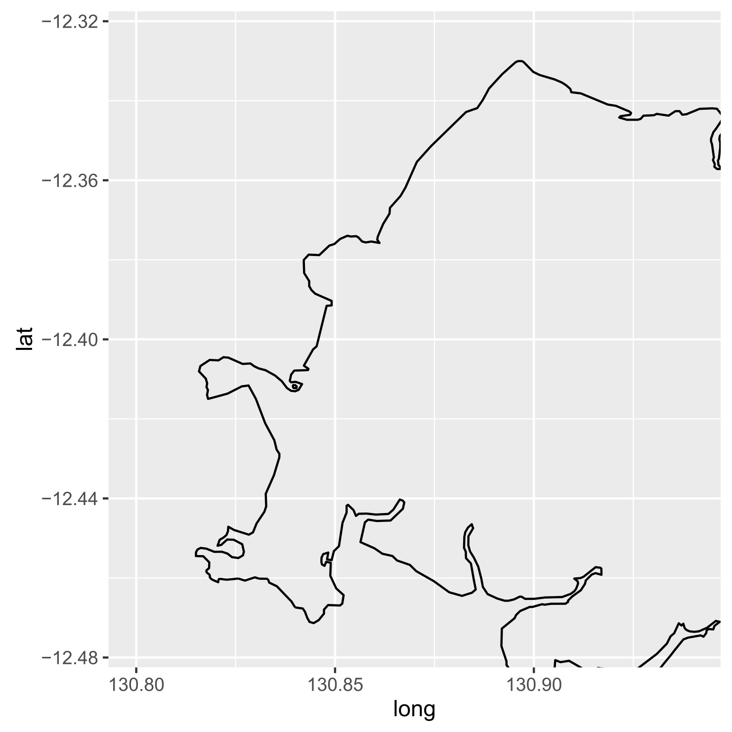
Alright, looking good.
Now we can go ahead and add some more layers depending on what we’d like to show. I’m going to add the ocean, mud flats, waterways, an overlay of built-up or inhabited areas, plus some points indicating our sampling sites. For most of the layers, I’ll use “geom_polygon” because I want to add a filled region (not just an outline). I’m also making use of the alpha parameter to alter the transparency of each layer to differentiate them. For the sampling sites, I’ll use “geom_point” to add points, plus a color, symbol type (pch=19 is a circle), and the point size (cex).
For the final touches, I’ll use “theme” to remove the background, increase the text size, and remove the axis titles.
ggplot() +
  aes(x=long, y=lat) +
  coord_equal(xlim=c(130.8, 130.94), ylim=c(-12.475, -12.325)) +
  geom_path(data=darwin, aes(group=group)) +
  geom_polygon(data=seas, aes(group=group), alpha=0.1) +
  geom_polygon(data=flats, aes(group=group), alpha=0.8) +
  geom_path(data=watercourses, aes(group=group)) +
  geom_polygon(data=pop, aes(group=group), alpha=0.5) +
  geom_point(data=coords, color='red', pch=19, cex=4) +
  theme(plot.background=element_blank(), panel.background=element_blank(), axis.text=element_text(colour='black',size=14), axis.title.x=element_blank(), axis.title.y=element_blank())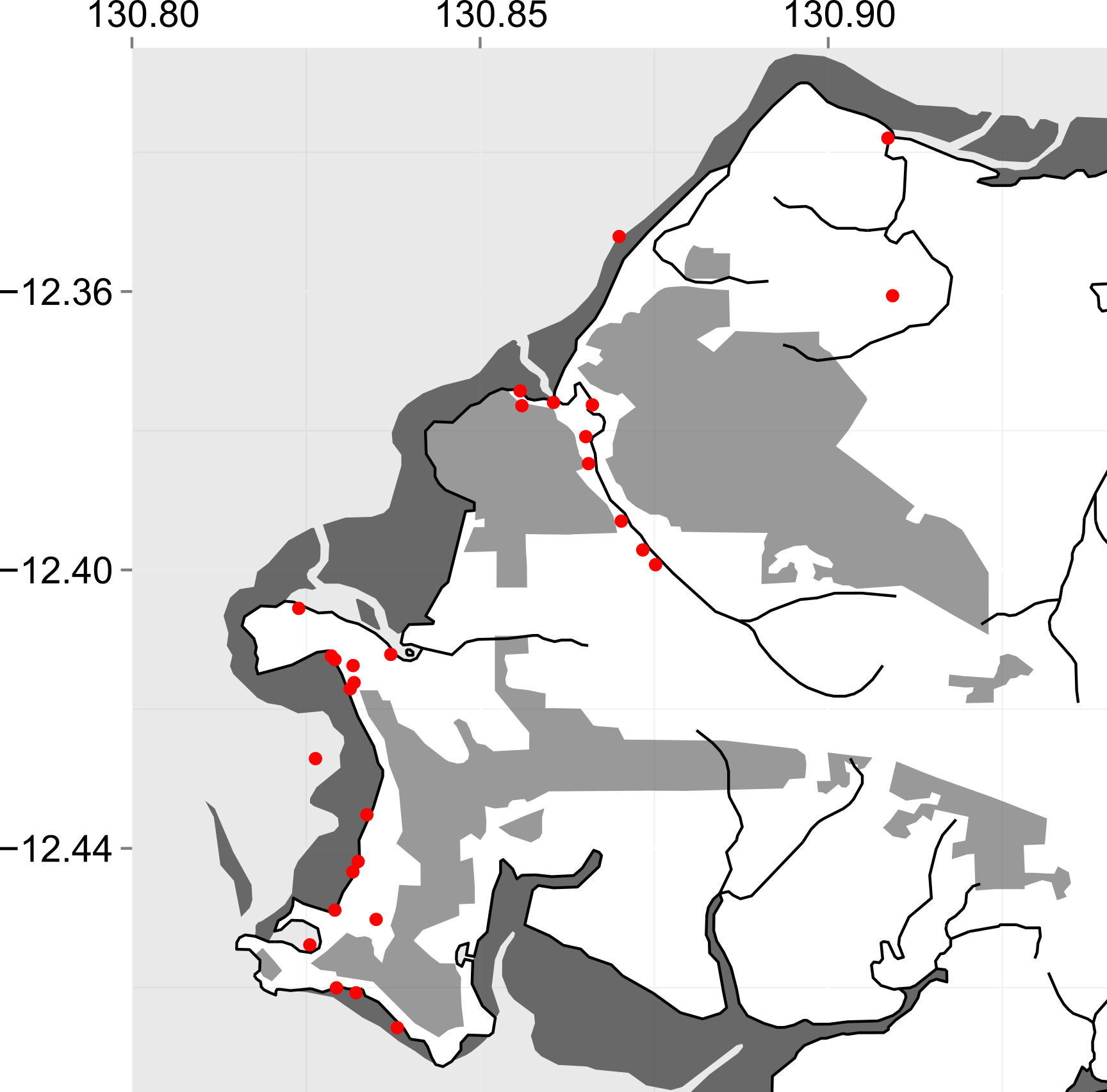
I then imported this figure into inkscape to add specific sampling types, keys, etc. The map of Australia in the top corner of Fig. 1 was drawn in ggplot using a similar method and added using inkscape.